Book 2-The Heir-Cover Reveal!
Dear Friend,
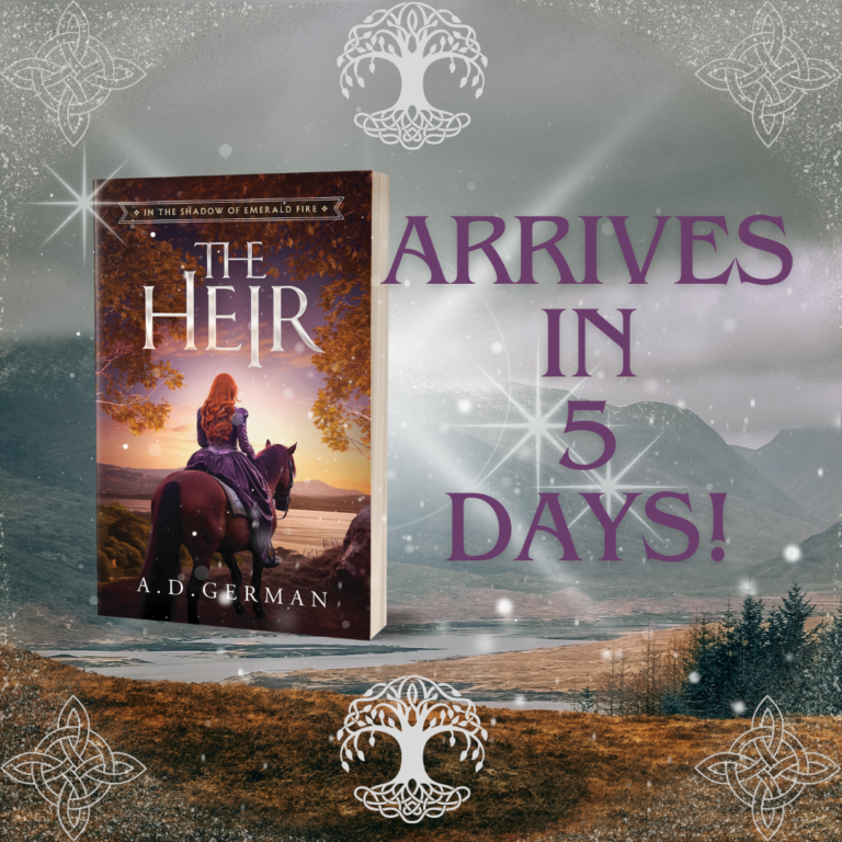
Here’s what you’ve (hopefully) been waiting for a long time! I know I have! Book 2-The Heir-Cover reveal!
Who did it?
Damonza has done it again!!! How amazing is this book cover?!
This was everything I really envisioned without realizing it. I know I shared with you before that both covers Damonza created for me initially, while beautiful, didn’t appeal to me, but, to be honest, that’s how it typically goes. My little brother encouraged me that the artist is never going to be able to completely get “inside my head,” so the concept of the end artwork will always be a little bit different than what I anticipated it would be.
Once I got myself out of the way, though, and was able to compare and contrast my two choices (I also had backing from my baby sister who helped me list the pros, cons, and which cover actually worked the best for The Heir!), I then realized that this book cover was hands down the winner! It’s gorgeous!
What did I change?
If you’re curious what I actually changed, it honestly wasn’t much. Mainly just her hair! I had them tweak it a lot, adjusted the title size and sheen just a little, and that was it! I fell in love with this cover much more quickly and easily than even the book cover for The Lost King’s Daughter (which I also totally love by the way!).
What do I love best about it?
The mood and color
I think what I loved best about The Heir’s cover art was the moodiness and the color scheme. This I chose myself, and Damonza pulled it off as only they can do. I also love the golden leaves. It fit the scene so well and added that beautiful pop of color that pulled everything together. I also really love how there’s a little bit of yellow in this book cover, too, as there was in The Lost King’s Daughter. It kinda pulls the two covers together and melds them well.
The details
I love all the details! From her dress, the color of it, the more feminine touches on it, and the puff on the sleeves to the delicate pattern and beautiful color of the horse’s blanket, it all just seemed to come together! And like my baby sister pointed out, Finockt’s dress is neat because it looks like she is going to battle, and swordplay, battles, skirmishes, and war are a huge part of this second book! Get ready for it!!!
The symbolism
I have really fallen in love with the symbolism in the cover! When I first received the cover art, I kinda felt like something was missing on the horizon (literally), and that Finockt needed to be focused on something. Then the more I considered it and talked it over with family and friends, the more I realized that having Finockt stare out into nothing was actually very symbolic. You’ll understand why when you read The Heir! It’s still amazing to me how Damonza pulled all this together, and yet they didn’t even have my manuscript!!
Your turn!
What do you love best about the cover art for The Heir? Is it everything you imagined? Do you find it intriguing? What details do you love best? I’m all ears. Contact me. I’d love to hear from you, and I’ll always find the time to write you back.
Have you started the series?
If you’re new to my debut YA medieval Christian fantasy series In the Shadow of Emerald Fire, learn all about the first book The Lost King’s Daughter here. Interested in purchasing? Find The Lost King’s Daughter in paperback at my store or check out Amazon for either an ebook or paperback.
In closing
Until next time, dear friend…I hope you enjoyed this Book 2-The Heir-cover reveal and are looking forward to my final decision on when The Heir will actually be released! TBD. I’ll definitely let you know when that date is feasible. God bless until then! xoxo
P.S. Are you a writer looking for a cover designer for your book? Check out Damonza! They are worth every penny! Great to work with, and you always come out with a stunning design…even if you’re indie published! 🙂


